In last week’s post about #TLDR (click here to read it) I talked again about the importance of keeping it short and sweet to help the chances of having your dream clients actually read your content. One of the ways to do that is by incorporating a few tricks to make your brand messaging “scannable.” Scanability is the magic word (that I made up) when it comes to delivering content in a way that will make your readers pay attention.

Here’s the top ways I make my text scannable.
-
- Lists (Duh!): Providing bulleted or numbered lists is a great way to break up a block of text. Blocks of text = the enemy. If you have stuff to say and you can either bullet it or make a list, do it.
- Lists (Duh!): Providing bulleted or numbered lists is a great way to break up a block of text. Blocks of text = the enemy. If you have stuff to say and you can either bullet it or make a list, do it.
-
- 5 Line Rule: Speaking of blocks of text, we do need them occasionally—we’ve got to deliver the goods after all! A good rule of thumb is to limit your paragraphs to about 5-7 lines. This is obviously dependent on factors like the width of screen and the size of your font. Bottom line: too much text and people will skip right over it. Don’t believe me? Watch your online browsing habits. I bet you just glide right over those big text blocks!
-
- Headings: Adding headings to a post is a great way to emphasize certain things for people to pay attention to and to create a hierarchy for the reader. Want an example? See what I did in last week’s post HERE. In that post the definition of #TLDR is in one font, the questions are in another, and the #1 tip is in a third font. These headings provide the reader some context so that they can scan each section separately.
-
- Emphasizing key points: As you can see, I bold certain lines in my text. I do this strategically with the main points of each paragraph. Changes you can make to emphasize your main points include changing the: color, style, size, or changing to bold, underlined, or italicized font. Make sure to use this sparingly because this technique can look busy quickly.
-
- Emojis: Hear me out before you get all 🤨. I know emojis can be annoying if you’re not a fan (like I am),
but they are a great tool for getting your content noticed in a newsfeed (Hello, COLOR
). They also break up your text and grab people’s attention.
Plus, they’re a great way to add some personality!
Even if you don’t use the sassy ones, I promise they will still work! 🤷🏻♀️
- Emojis: Hear me out before you get all 🤨. I know emojis can be annoying if you’re not a fan (like I am),
-
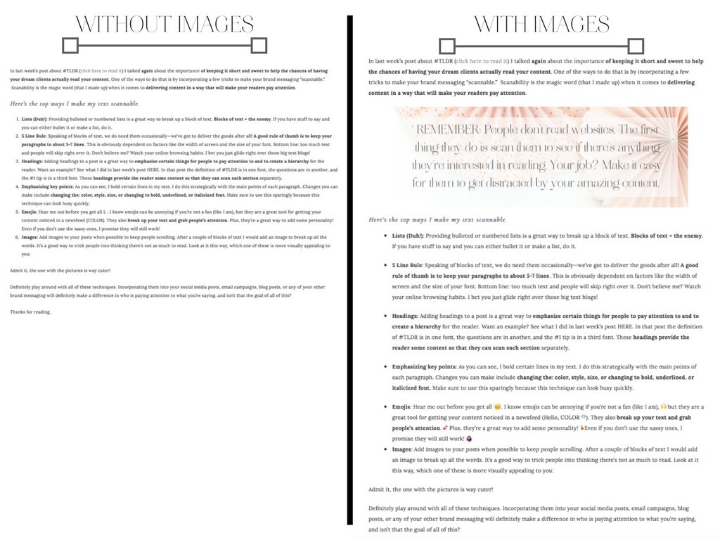
- Images: Add images to your posts when possible to keep people scrolling. After a couple of blocks of text I would add an image to break up all the words. It’s a good way to trick people into thinking there’s not as much to read. Plus it makes you content much more visually appealing a whole lot less dense. Which one of these would you rather read?

Admit it, the one with the pictures is way cuter and much more reader-friendly!
Definitely play around with all of these techniques. Incorporating them into your social media posts, email campaigns, blog posts, or any of your other brand messaging will definitely make a difference in getting your audience to pay attention to what you’re saying, and isn’t that the goal of all of this?
Thanks for reading,


